A large proportion of people more easily perceive information when it is presented visually. You can do it yourself with the help of presentations and reports using charts and graphs. It is an indispensable component of almost any analytical activity.
At the same time, even a beginner can handle the construction of charts and graphs in Excel. It’s not as difficult as it initially seems.

But you will need to master some of the nuances, understand the principles of construction, and carefully study the functionality of the program.
Graphs and diagrams require separate consideration.
Contents
Plotting
It’s worth starting with how you can plot function and data graphs in Excel.
The graph displays changes in data. Most often, changes are associated with time. For example, a company received a certain profit for a certain period of time. There are many options. But the essence is the same everywhere.
Most often, graphs are built using data from an Excel spreadsheet. After all, Excel is the main tool for working with tables.

To create a graph, you need to take a look at what Excel offers and how to take advantage of them.
The simplest graph
Since graphs reflect changes in certain data, certain information must be embedded in them.
There is initial information. And on it you need to figure out how to correctly build a graph in Excel for this data. It will display events taking place at different time stages.
For example, every year a certain number of applicants enter the university. Now, step by step about how to add the simplest graph, and what Excel offers for this in general.
Here the sequence of actions is as follows:
- first open the “Insert” tab, where several diagrams will be presented to choose from;
- click on “Graph”;
- select the chart type in the pop-up window;
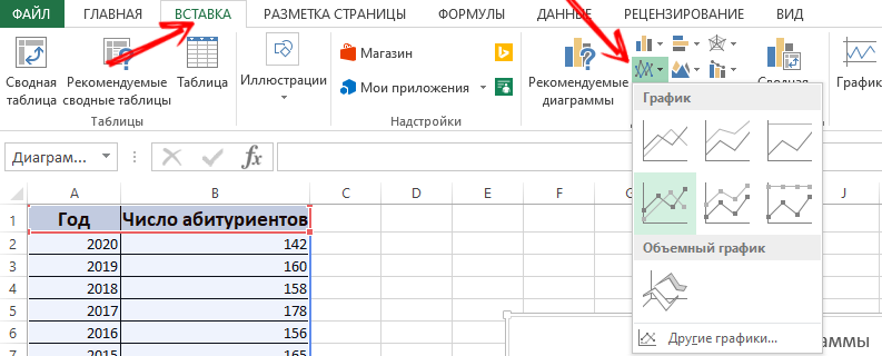
- when you hover the cursor, a hint will pop up about where this or that type is better to use;
- now you need to choose the appropriate option;
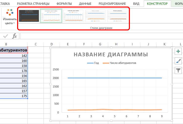
- also copy and paste the table with the source information into the diagram area.
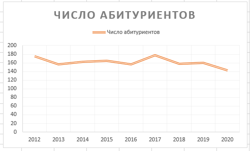
Confirm the action and wait for the result. The blue horizontal line is unnecessary. To remove it, just select and delete.
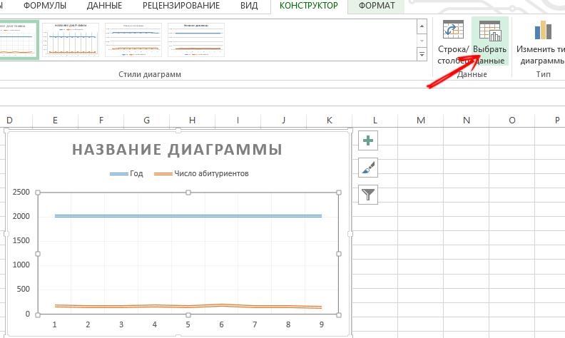
Only one curve will be used here. Therefore, feel free to delete the information to the right of the graph. It’s called a “legend.” For clarification, add captions to the markers. To do this, open the “Layout” tab, and select “Data Signatures”. Here select the place where the numbers will be located.
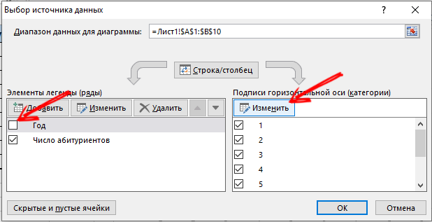
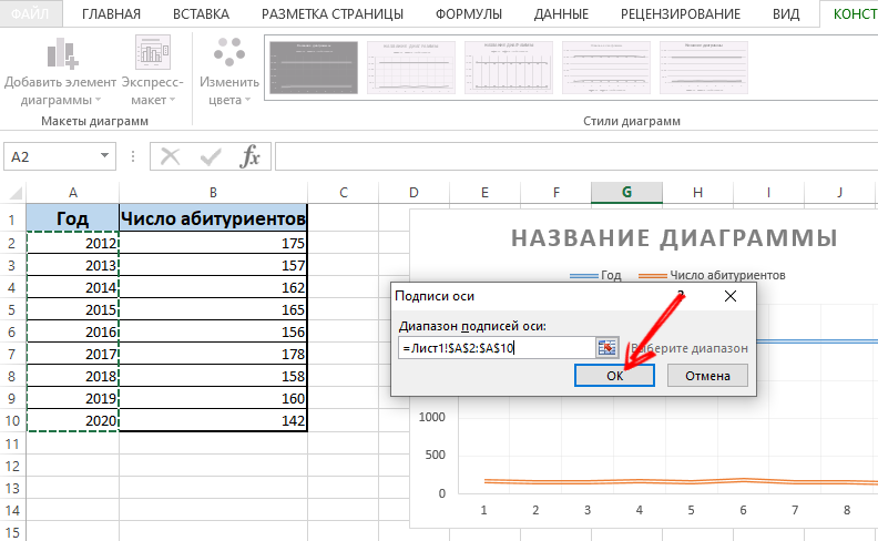
You can further improve the chart through the “Layout” menu and the “Axes titles” section.
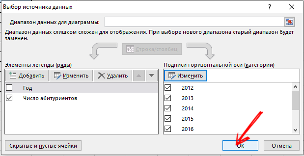
Move the title as you see fit. You can change the font style, fill, resize. All this is done through the “Chart Title” tab.
Two or more curves
You can also insert and modify a graph through Excel, in which there will be 2 or more curves.
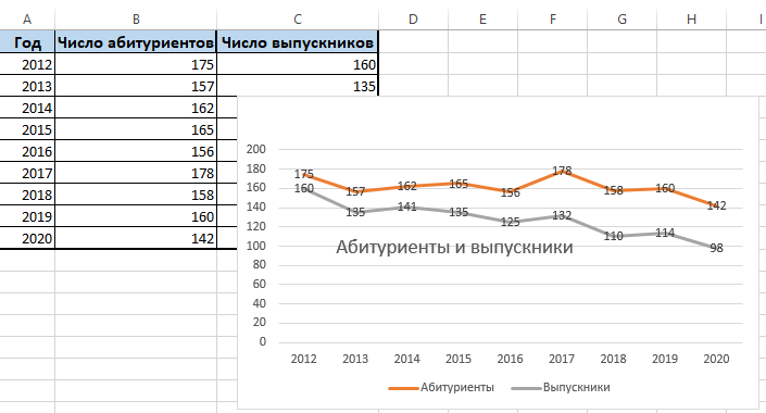
For example, you need to show not only the number of people who entered the university, but also the number of graduates over the same period. That is, more initial information appears in the table. Although the principle of creating a graph does not change. But it makes sense not to delete the legend.
If necessary, you can add an additional axis with the same used units of measure according to the instructions that have already been presented above. If the data presented is of a different type, an auxiliary axis is required.
In this case, you need to draw the corresponding graphs through the Excel application using the following algorithm:
- plot the graph as if using the same units;
- select the axis where you want to add another, auxiliary;
- click on this axis with the right mouse button;
- select the option “Format data series”, and then go to the section “Series parameters”;
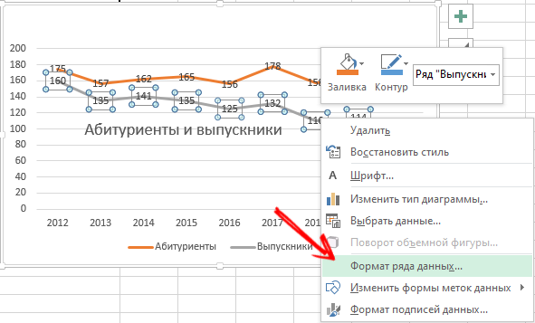
- here you need to click on “Along the auxiliary axis”;
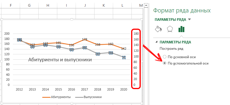
- close the window, after which another axis should appear.
This option has an alternative solution. Another way is that you can change the type of chart used.
Here you need:
- first click with the right mouse button on the line that requires an additional axis;
- then click on “Change chart type for a series”;
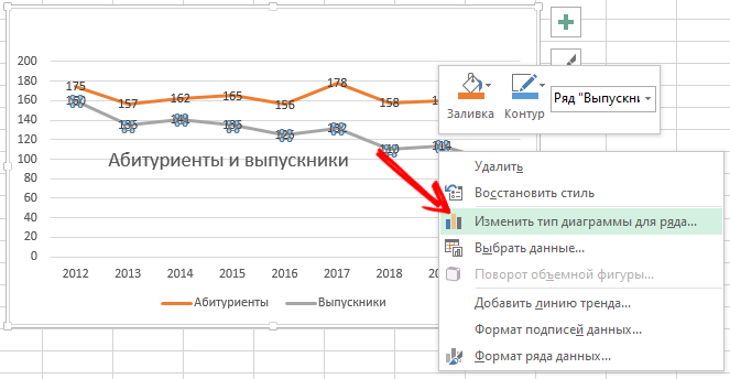
- select the type of the second row of information.
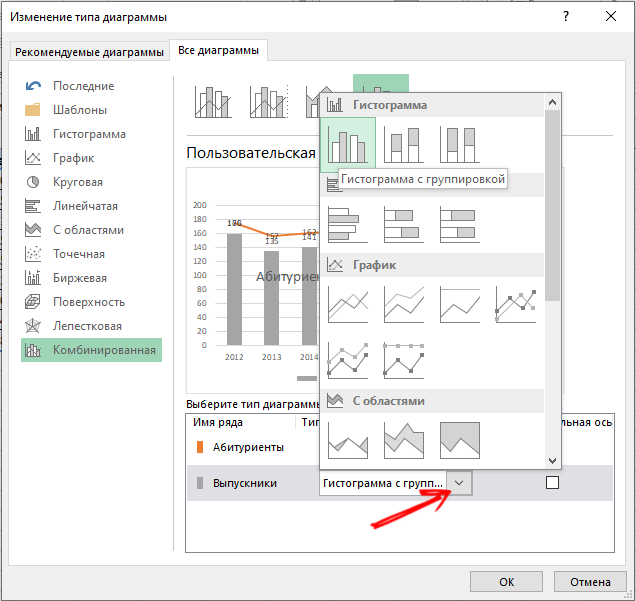
Confirm the changes and enjoy the revised schedule.
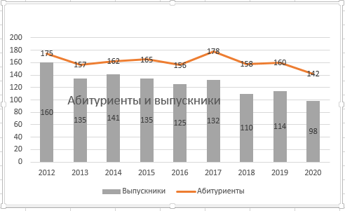
As you can see, here it is enough to perform a few clicks, and the additional axis is done.
Function graph
There is also a more complex option, when there is a function, and you need to draw or draw a corresponding graph based on it.
Acting step by step, the whole procedure can be divided into 2 stages:
- creating a table;
- formation of the schedule.
First you need to create a table. There are conditionally 2 columns. These are X and Y.
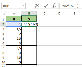
There is a conditional formula Y = X (X-2) with a step of 0.5.
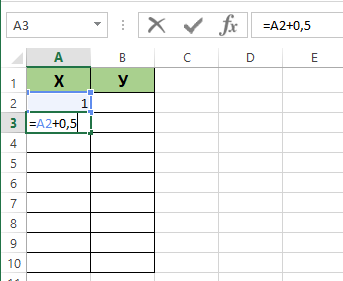
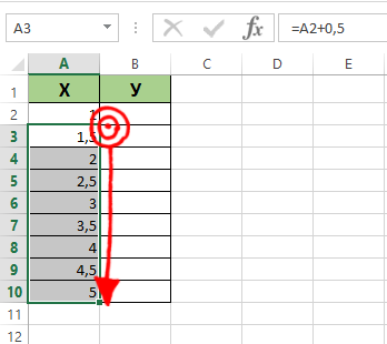
The first column will have an X. And the value for the first cell will be 1. Each subsequent cell is 0.5 larger than the previous one. You need to insert the formula = (cell name) + 0.5. Now select the lower right corner of the cell where the formula is and drag down. This will automatically fill the cells with values.
The second column is Y. The calculation formula is written here, which is used to form the graph of the function. Therefore, you need to click on Enter. The program will calculate all the set values. The formula can be multiplied by column by pulling down the corner of the cell. That’s it, the table is there.
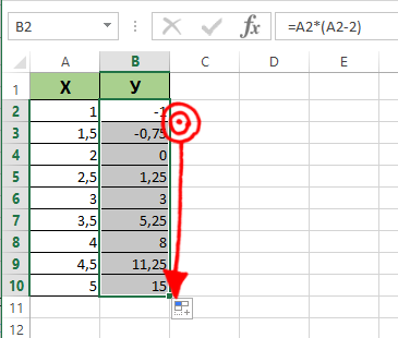
The further algorithm is as follows:
- open a new sheet;
- click “Insert”, go to the “Diagram” section;
- select the “Spot” option;
- use the type that you like best;
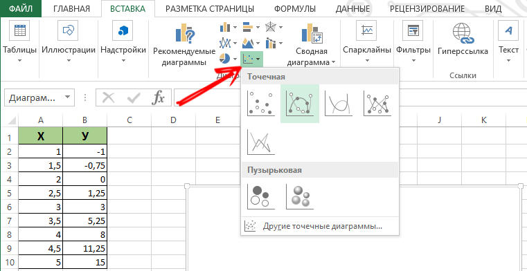
- click on the area of your diagram with the right mouse button;
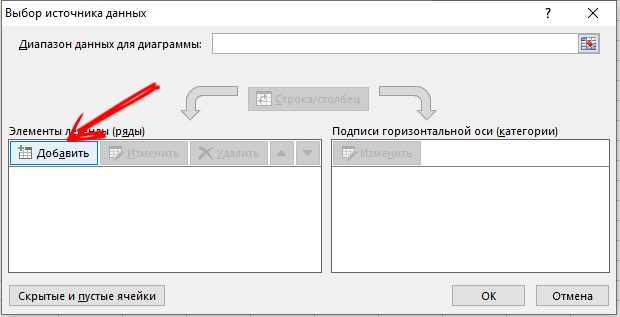
- click on “Select data”;
- now select the values from the first column, that is, X, and then click on “Add”;
- when a window with the name “Change a row” appears, give it a name, as well as the first column for the X value, and the second for Y;
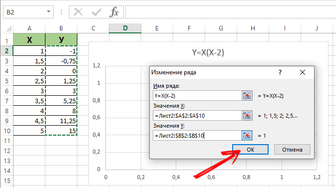
- click on OK and see what happens.
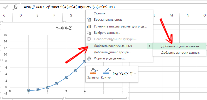
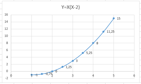
Perhaps there will be no values on the X axis, but only numbers on the points. To fix this flaw, you need to make the axis labels of your chart. Just right-click and click on the “Select data” menu, then change for the horizontal axis of the signature. Select the desired range here. Now the chart takes on a full-fledged completed appearance.
Combining and overlaying
There is nothing difficult in making a couple of graphs at once in Excel. To do this, you need to combine 2 different function graphs in one field using a spreadsheet application. Add a new formula to the previous one. Let’s say it will be the formula Z = X (X-3).
Select this data and paste it into the field of the existing chart. Through the corresponding menu “Select data” you can edit the information if there are any inaccuracies or discrepancies.
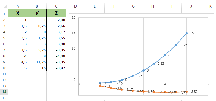
That’s it, now a couple of function graphs are harmoniously within the same field.
How to make a dependency graph
In this case, information from one row or column will depend on the original data from another column or row.
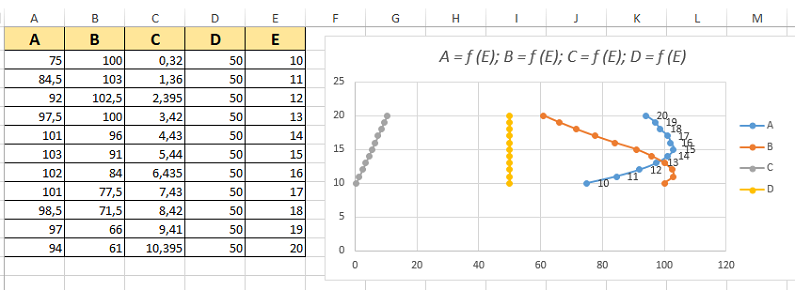
First, select the appropriate chart type. The point version with markers and smooth curves looks good. But you can choose what you like best or is suitable for a specific task.
Now data selection is performed, click on the “Add” button. Here you can adhere to the following principle:
- the name of the row will be A;
- the X values will be the A values;
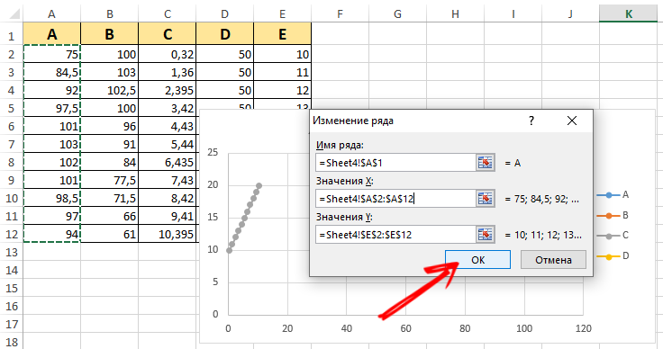
- for Y, the value of E;
- click “Add” again;
- now the row name will be B, and the X value is the data from column B;
- for Y, the values are the data from the E column.
The rest of the table is built according to the corresponding principle.
How easy or difficult it is, each user determines independently. It is worth trying, practicing, considering a few illustrative examples. The more experience and knowledge, the easier it is to work with charts through Excel.
Building diagrams
In addition to graphs, there are also diagrams that also simplify the perception of this or that information. This is especially true for data with numeric values. They can be compared with each other, compared.
There are several options for how you can create charts in Excel. They can display different values in a way that is convenient for users to perceive them. Therefore, all sorts of options are applied. Including scatter and dynamic graphs in Excel spreadsheet program.
Chart over source table
First, how to make a visual chart using data from an Excel spreadsheet.
Here you need to follow several step-by-step procedures:
- to begin with, create a table where the necessary data will be presented, at your discretion;
- then select an area with values, on the basis of which the diagram will be formed;
- select the “Insert” tab and click on one of the chart types you like;
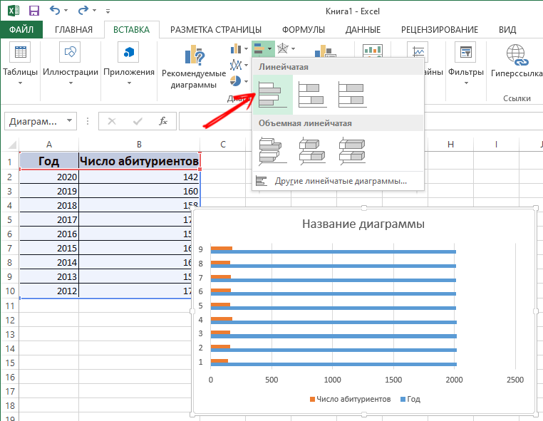
- alternatively, select a histogram, and then one of its options;
- after select the presentation appears automatically.
In general, it is not difficult to make such a chart on your own in Excel, working on a table. However, an automatically generated presentation may not be satisfying to the full. Changes need to be made.
For this:
- double click on the name, and write down the name you need for the histogram;
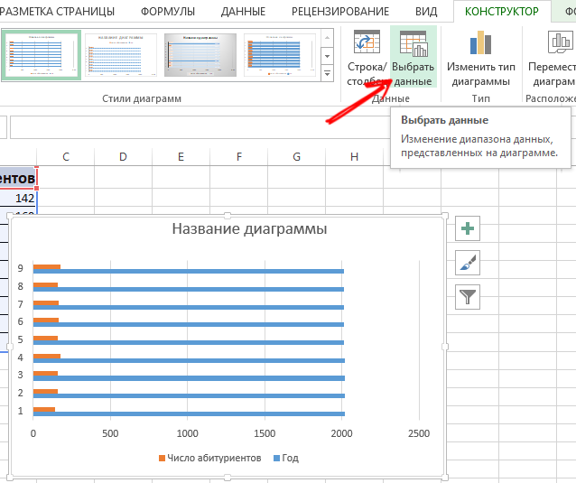
- now change the label of the vertical axis;
- here you should go to the “Layout” tab, then to “Signatures”, and select “Axes Name”;
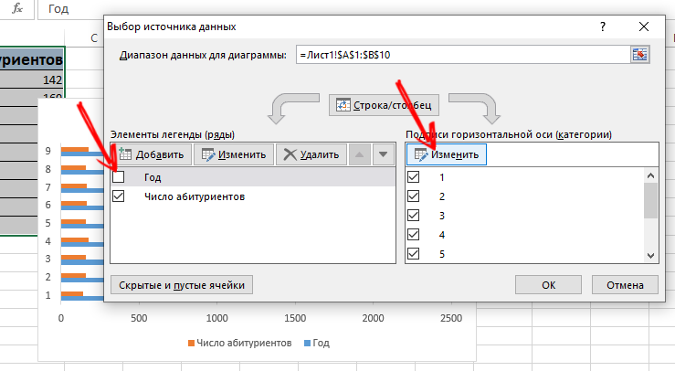
- click on the vertical axis, and select its name;
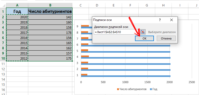
- if there is not much data in the table, the record on the right, that is, the legend, can be safely removed by clicking on it and clicking Delete;
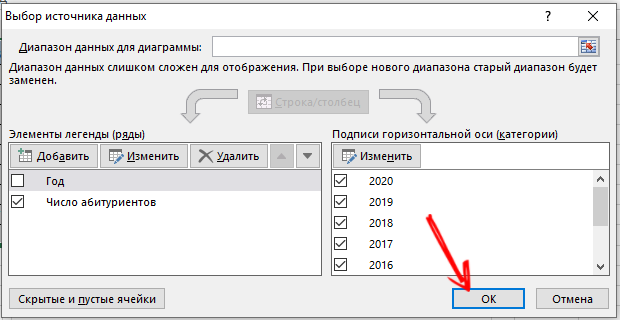
- you can also replace the standard styles and colors through the “Design” tab and the “Chart Styles” menu.
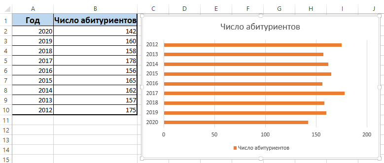
The diagram is fully editable, which allows you to give it the look the user wants. If you wish, you can make a pie chart, scatter, bar, etc. In this regard, Excel is quite powerful and functional.
Adding data to a chart
There is a situation when there is a ready-made chart, but new data needs to be added to it through Excel.
This is not difficult. The instruction looks like this:
- add a new value to the original table, write down the corresponding numbers, come up with a name;
- now select the range with new data, capturing the name;
- copy to clipboard;
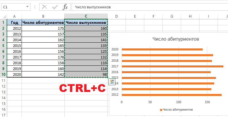
- select the previously created diagram;
- insert the fragment selected at the previous step from the updated table.
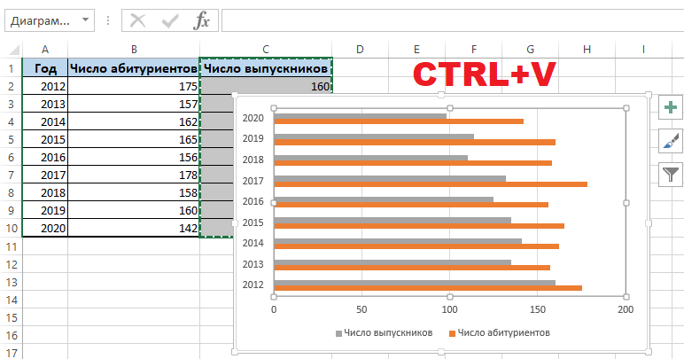
Since the new data in the graph is not entirely clear, a legend comes to the rescue here. To do this, open the “Layout” tab, click on the “Legend” menu, and here add it to the right, bottom, top, or use another suitable option.
The legend in combination with different colors of the histogram makes it clear where the data is, how they are related to each other. Everything is clear and visually easy to perceive.
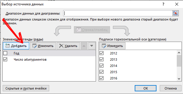
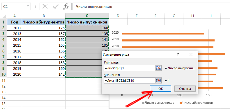
Although there is an alternative way to add data to an already created chart. It’s more complex. The menu “Select data source” is used here. To open it, you need to right-click and click on “Select data”. By clicking on the “Add” button, a line will appear through which you can select a data range.
How to swap the axes
There are also situations when you need to swap different axes in the created chart using Excel.
This is not difficult to do. You just need to build on the following instruction:
- select the diagram and right-click on it;
- in the context menu, click on “Select data”;
- a new menu will appear, where click on the “Row / Column” option.
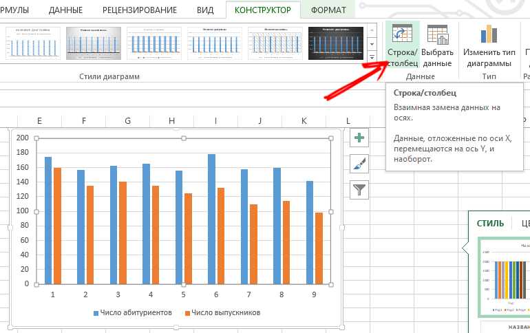
Now the parameters for categories and rows are automatically swapped with each other.
Control elements
Excel also allows you to freeze controls that will be located on the created chart.
Relevant in cases when new information is regularly added to the histogram. And it is not very convenient to change the range every time.
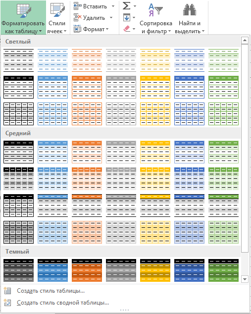
The most optimal solution in such a situation would be a dynamic chart. That is, it will be able to automatically update. In order for the controls to be assigned to the histogram, you need to transform the data area into a so-called smart table.
Here the user will be required to do the following:
- highlight a range of values;
- in the main menu, click on “Format as table”;

- a new window will appear where you can choose any style to your taste;
- agree with the program’s proposal to select a range;
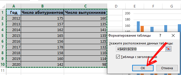
- when you enter new values, the diagram itself will begin to change in parallel, that is, it will become dynamic.
This is how the ready-made data is used, which is converted into a smart table. Or you can do everything from scratch by selecting the “Insert” menu, and then create new parameters through the “Table” section.
Percentage chart
Some information is easier and more convenient to perceive if it is presented not just in numbers, but in percentages.
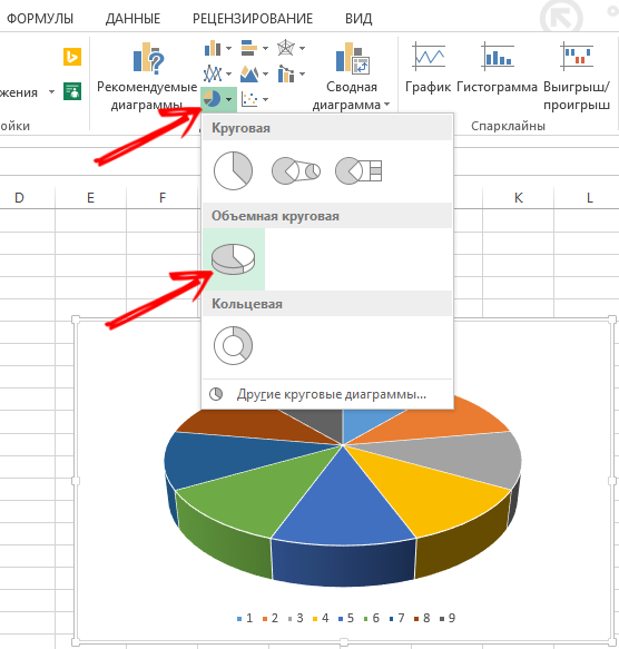
For such tasks, it is better to use a pie chart type.
Taking certain initial data, it is necessary:
- select data from the table;
- open the “Insert” tab;
- then click on “Circular” and select the volumetric type;
- in the “Design” tab, click on “Chart layouts”;
- here, among the options, there are several styles with percentages;
- choose the appropriate type.
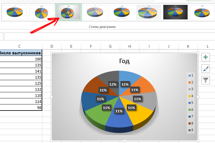
If the percentages are low, these sectors can be difficult to see. To select them through the constructor, you need to change the type of the chart, and select the circular with the secondary one.
When a percentage chart is generated automatically, it is often not completely satisfactory for the user. Therefore, here you can click on any of the sectors with the right button, after which the border points appear. Select “Data Series Format” from the context menu. Now the required parameters are set for the row and the changes are saved.
Gfuan diagram
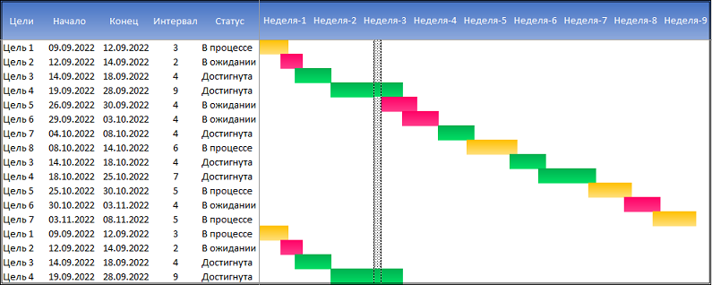
Special attention should be paid to the diagram, with the help of which you can display the data of a multi-stage event in the form of columns. Nice and not difficult at all.
Let’s say that the diagram is for a teacher who keeps track of deadlines for reports. You need to do the following:
- prepare a table with initial information;
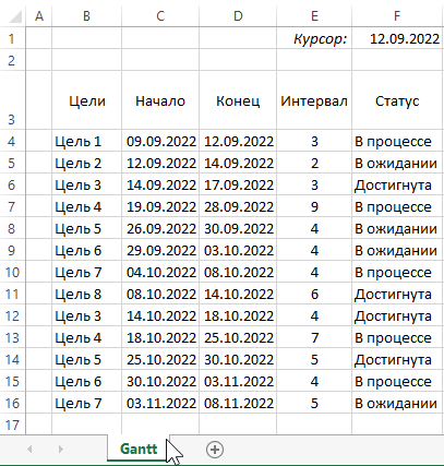
- add a column to the chart showing the number of days;
- the column is filled with a formula;

- select the range in which the created Gantt chart will be located;
- cells here will have a fill of a different color between the start date and the end of the due date;
- select “Conditional Formatting” in the main menu;
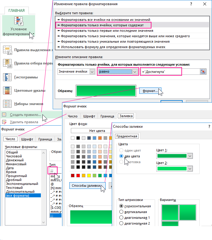
- click on “Create rule” and then click on the item “Use a formula to define cells”;
- here write the formula = AND (E $ 2> = $ B3; E $ 2 <= $ D3);
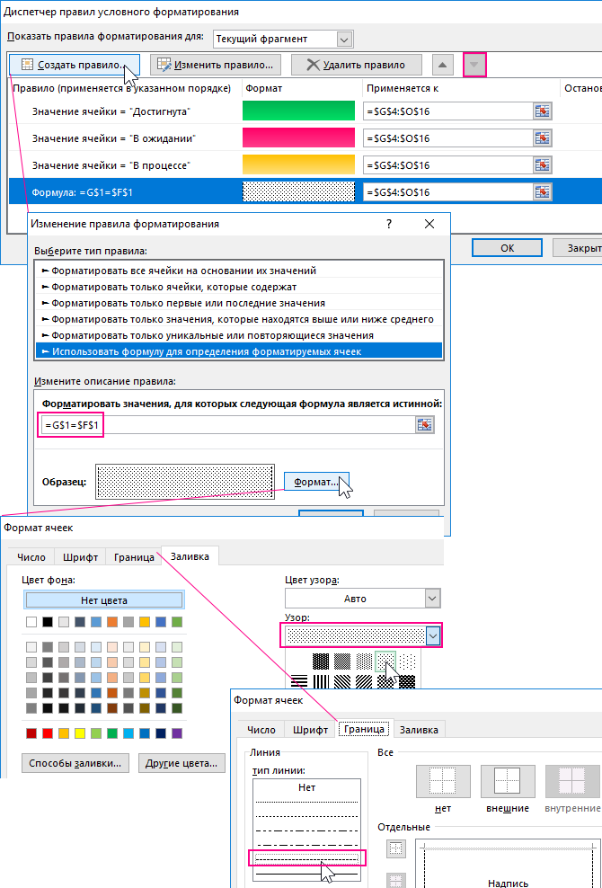
- here the chart, as an operator, will compare the date for a specific cell with the start and end dates of the event;
- now click on “Format” and select the appropriate fill colors.
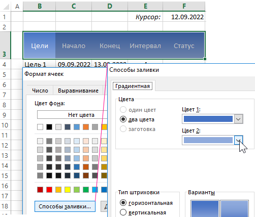
Check if you are fully satisfied with the result.
This task is not difficult to accomplish. But there are some nuances in working with graphs and charts through Excel.
Have you ever worked with a graph or chart? What were they for? What difficulties have you encountered? What can you advise for beginners in this business?
Share your experience and leave your comments. Subscribe, ask questions and tell your friends about our project!