and make seamless carousels a highlight of your profile.
Contents
How to make an Instagram carousel
And like a regular post! With one caveat – add several photos instead of one.

Click “Select several”, and indicate with numbers in what sequence and what photos will be published. Then apply the filter to all images at once, or edit each one individually. Write your text, add hashtags and post the carousel on Instagram.
You can upload a maximum of 10 photos or videos to the Instagram carousel.
Remember the technical point: the format of the entire carousel is set by the first photo or video.
That is, if your carousel cover is a standard square, and the next image is in 4: 5 format, then be prepared for the fact that the social network will cut it to a square. This is often overlooked, especially when posting videos.
There are unspoken rules for publishing photo carousels on Instagram:
- if what you want to show can cause a contradictory reaction from users, hide it on slide 2 or 3 of the carousel, and warn readers in the text of the post about it;
- if you want to place text in slides – start placing at least 2 slides, put a photo on the first one. An exception is brand pages created solely for customer reviews;
- if you have an advertising publication, use the rule of constructing slides as with text: cover, intro, body, call to action.
If you are afraid that users will forget to look through the pictures, remind them about it. This can be done in two ways:
- write in the text of the post;
- on the cover of the carousel, that is, on the first slide, put the arrow to the right.

Please note that it is not possible to add a photo to the Instagram carousel after the post is released. By opening the post editing, you can mark the account in the pictures, change the text or geotag, but not the pictures themselves. Therefore, always check if everything is in order immediately after the carousel is published. If something is wrong, delete and download again.
How to make a seamless Instagram carousel
A seamless carousel is when you flip through the slides and get a single image.

The idea is simple – so that when you flip through a photo in the gallery, you get a single image, you should make a carousel on Instagram from one image (panorama, blank), divided into separate photos in 1: 1 or 4: 5 format.
Is it better to use 1: 1 or 4: 5? Let’s compare:

For everything to work out, the stock for dividing by slides in the carousel should be in the following proportions:
- if the pictures in the carousel are square, the height is 1080 pixels, and the length of 1080 is the number of slides in the carousel. If there are 4 of them, then the length should be 4320 pixels;
- for 4: 5 format, the length of the image will be calculated as for square pictures. If you do not want to memorize all the lengths of the formats, it is easy to calculate the height, remembering school algebra lessons.
We make the proportion:
1080 pixels – 4 parts
X pixels – 5 parts
X = 1080 * 5/4 = 1350 pixels.
To summarize: for a carousel of 4 square pictures, the original photo should be 4320 x 1080. For a carousel of 4 pictures in 4: 5 format, the original image will be 4320 x 1350.
Let’s clarify that 1080 pixels is the maximum width and height of an Instagram square. Your pictures may well be smaller, but you already know how to calculate the rest of the lengths.
Consider creating a seamless carousel:
- using the example of a finished image;
- using an example of a created illustration from scratch.
Algorithm:
- We create a blank using a suitable program.
- We cut into slides using another suitable program.
- Uploading images to Instagram in the form of a photo carousel.
Creating a blank using the example of a finished image
Take Canva.
If you have never used this popular service, learn all about it in our article: ” Canva Service Overview “.
Go to the home page and select a custom size for your future design. Set image parameters and click “Create Design”.
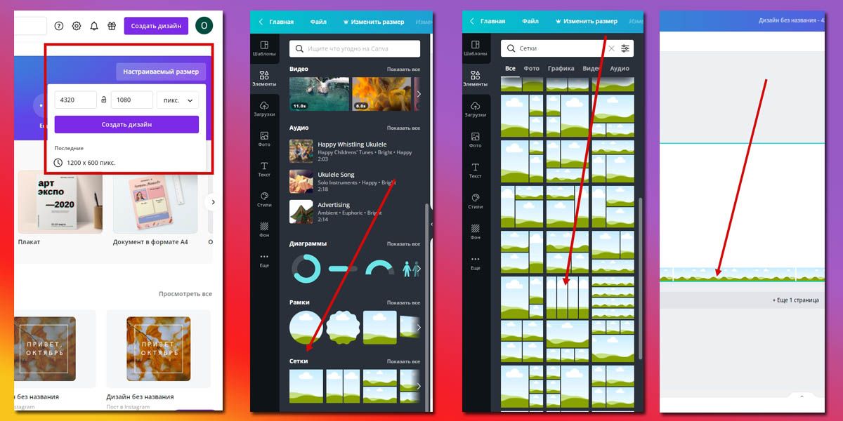
This is necessary so that you can see where the borders of the pictures for the carousel will go. For convenience, reduce the mesh so that it stays only at the very bottom.
You can also mark the future borders of the slides using a liner. Go to File – Show Rulers. Move the cursor over the ruler until you see the back and forth arrows. Click, and without releasing, drag the line to the desired location. Convenient, but less fast way.
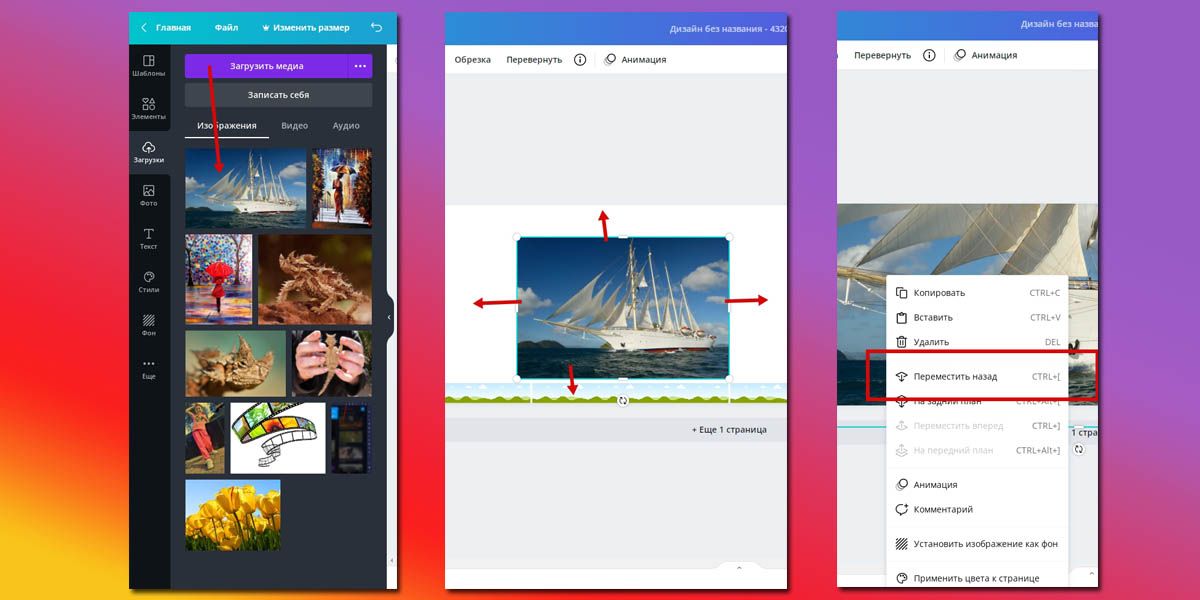
We stretched the photo across the entire area of the future carousel images, moved the image up and down to select the best fragment. To make the frame grid visible, send the photo to background by right-clicking on it.
So, the main image is ready. Write text on slides in Instagram carousel, additional elements, frames. Then remove the mesh from the image.

Remember that if you used paid elements in your design, you will have to buy them.
Creating a blank from scratch
The principle of creating a blank for a carousel from scratch is the same as using a finished image, only the background or a combination of some elements is taken as the basis.

Arranged the text so that it does not break with the border of the slides. When everything was ready, we removed the grid and saved the image.
We cut the workpiece into slides on a smartphone
Programs that can cut a panoramic image into parts are enough. Let’s look at PanoramaSplit as an example .
On the main page, click choose photo and add the created template to the program. There are two main tools:
- number of carousel slides – numbers at the bottom of the screen;
- adjusting the size of the picture for slides – the slider above the numbers.
The point is as follows: choose the intended number of slides, the program shows the corresponding frames on the blank. By moving the slider, adjust the image so that it occupies the entire space of the future carousel. Click split, and on the next screen post to instagram.
Do not be alarmed that the publication will begin right now, no. It’s just that the button for saving to the Smartphone Gallery is called so here.
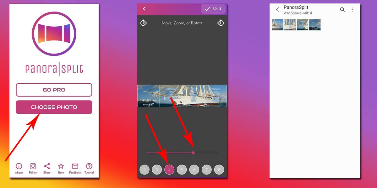
We cut the workpiece into slides on the computer
There are also many options to make several images from one image on a computer. For fans of online services – IMGonline .

And for lovers of programs there is Photoshop, in which you can not only cut into pieces, but also create from scratch.
Examples of beautiful seamless Instagram carousels
The main niche for using seamless carousels on Instagram is ads that appear on your feed. But there are accounts that have made such carousels their feature.
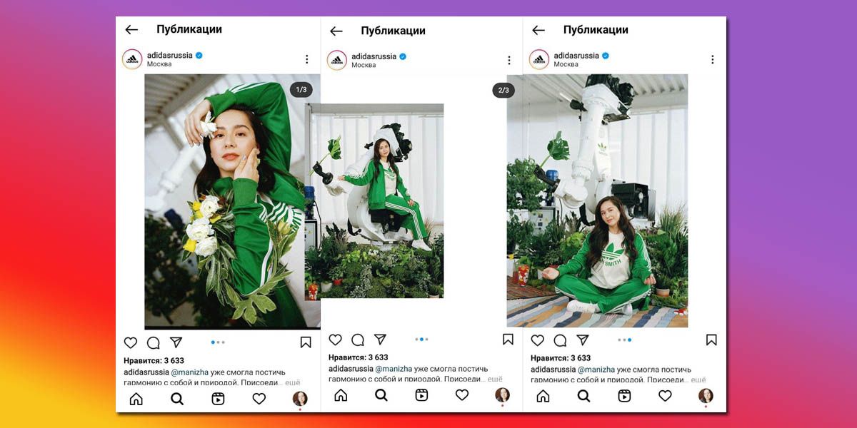
Of course, you could just put three photos in the carousel and not invent. But it’s more interesting, more creative, and maintains the overall style of the page.
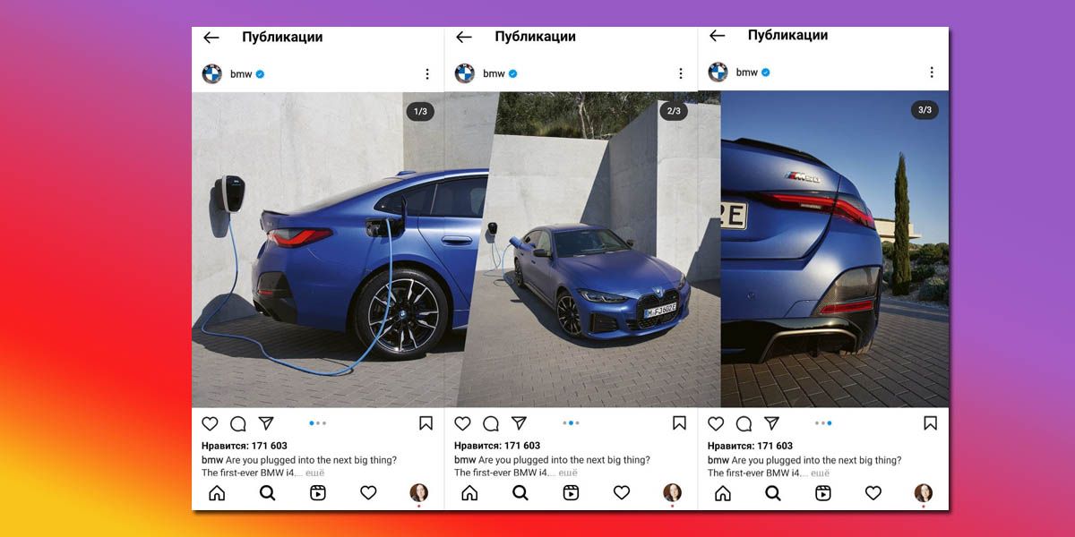
Such oblique / straight transitions are a distinctive feature of the BMW blog. An unusual way to show the product from different angles.
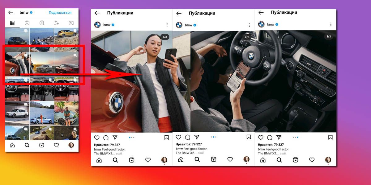
An interesting solution: first, when flipping through blog posts, the gaze clings to a single picture, and then it is spurred by interest to flip through slides in the carousel to see the steering wheel.
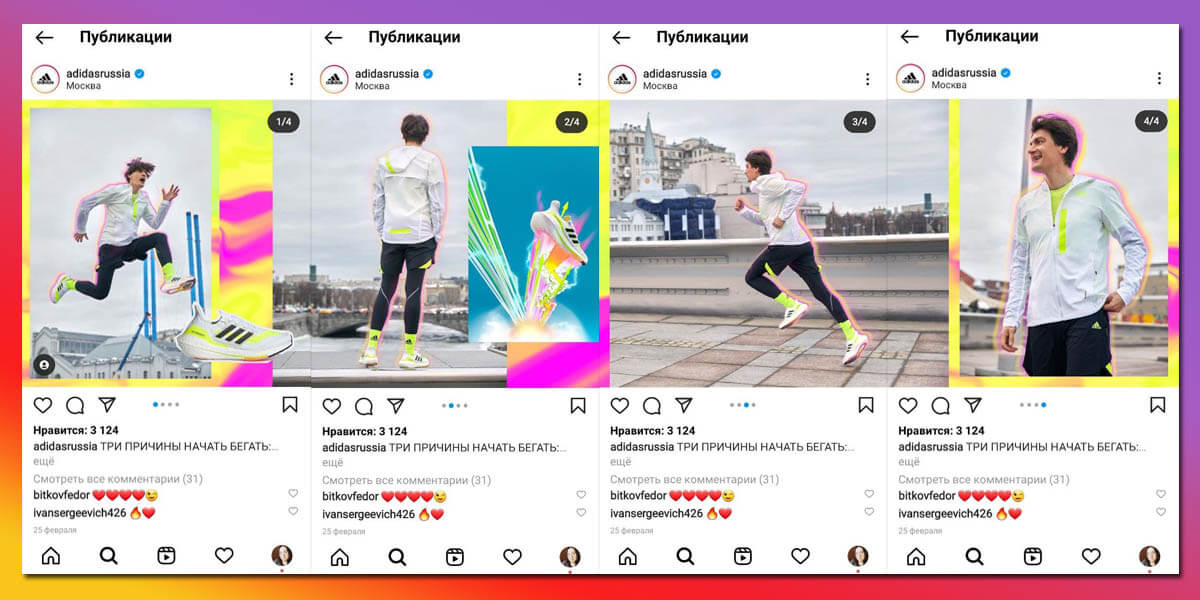
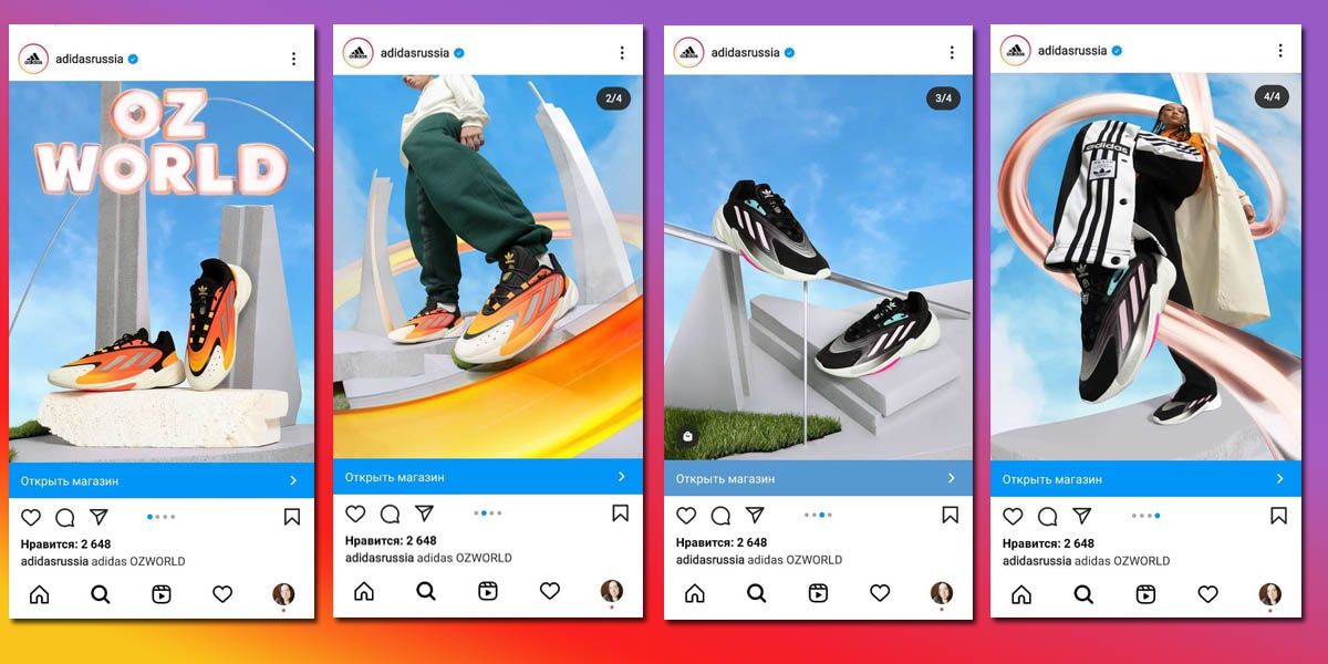
And in this video – a unique seamless video carousel!
How to make an Instagram carousel from a computer
Start creating a new post on Instagram. Those who are not familiar with the posting service on social networks.
Fans of a unified style will find it convenient to go straight from the application to Canva by clicking on the appropriate button, create an image there, and … it will be immediately added to this post creation window.
If you only need a small correction of existing pictures, click on the pencil in the upper left corner of the image. The built-in photo editor it is at your service.
After the images are ready, write the post text, add hashtags, tags, choose the time of the stay and publish. This is a convenient way to post carousels to Instagram from your computer.
How to use a carousel on Instagram commercial accounts
Let’s move on to cases using albums.
Before and After Case
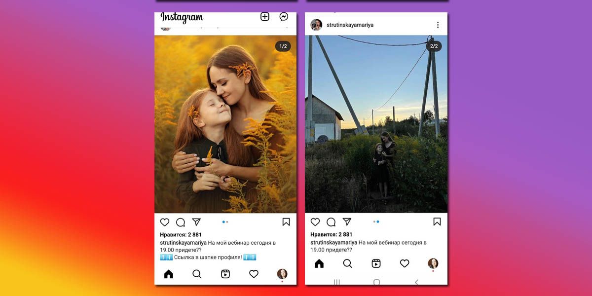
Makeup artists, photographers, and stylists are more jubilant than others: they don’t have to make ugly collages to show the effect of their work. Feel free to upload the final result to the main album, and hide the details of the work inside it.
Case “360 degrees”
This case was asked for in the pens of the sellers of everything: clothes, equipment, cosmetics. Now the product can be shown from all sides. If you sell clothes, take a photo of the model in the dress from the front, side and back. It is important for online shoppers to see the product from different angles.

SFS (mentioned per mention)
It is noticeable that Instagram makes its updates not only in favor of promoting the business, but also in the direction of getting rid of the trash. At first, we were allowed to remove all unnecessary things in Stories, and now it can be done in albums as well. SFS results were usually posted by bloggers in the form of a continuous feed of posts. Quite frankly, this did not please the audience in any way. Now the results can be hidden in albums. Or spread only in History, yes.
Case “Master class”
For example, you have a blog about SMM and you train people. Combine tips on one topic, overlay them on a photo or picture, and upload them to an album. If you did an interview, but you know that no one will go to your site from Instagram, take the main phrases and fill them in the album. Making cakes? Explain the process step by step in the photo. And so on.


Case “Comics”
Creating a 10-slide story on a blog topic is fun not only for creators, but also for readers.

Case “Hidden Text”
It doesn’t matter if the 2200 characters of the post were really not enough to describe your thoughts. Describing the essence for 1000 characters in the text of the post, and then sending it to the end of the carousel is a way to keep the reader as long as possible. And those who first start scrolling through the carousel will see the text and are more likely to start reading the information under the carousel, i.e. from the beginning.
It’s easy to make such a carousel – just write the entire post in notes on your smartphone or in a notebook on your computer, and then take screenshots. You can remove unnecessary things using standard image editing tools.

See how competently: take the readers to the carousel, but before showing the text – once again demonstrate the product. And at the end, finishing with a chord again, a photo of the product. A five for a blogger for such a product presentation.
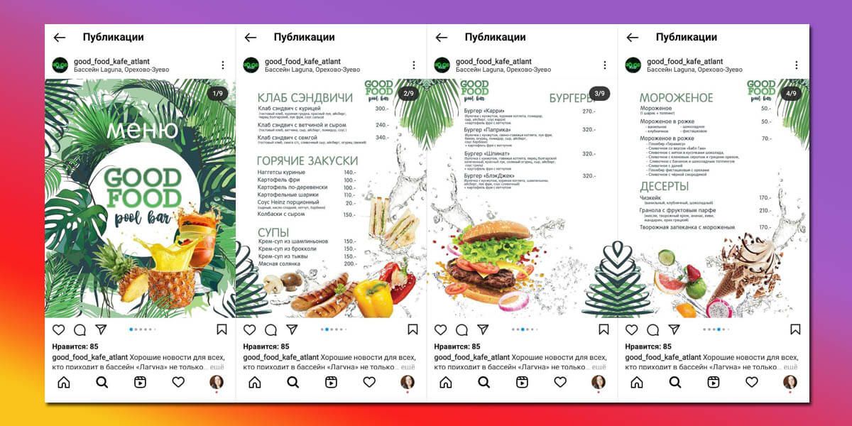
Case “Menu or catalog”
Carousels are designed for restaurants and cafes. With their help, it is convenient to present a seasonal menu or a special offer. You can also create a product catalog. Use Instagram succinctly, the more it contributes to this.
Let’s summarize
The moral of “this fable” is this: give people the opportunity to linger on your post using the carousel on Instagram. Now you know what it is and how to upload it to the social network!
But if your photos do not yet reach the “Instagram” level, read our material ” How to make a professional photo for Instagram ” and become aces in the world of photo pictures!