Contents
Introduction
Most users are accustomed to creating beautiful presentations exclusively in Power Point. And this is not surprising, because any person, even not an IT professional, will be able to create a colorful attractive design in a short time – a unique advertising presentation of a written term paper, a graduation project, and maybe even a new product or service provided. With the help of the built-in toolkit, the user will be able to “breathe life” into his idea, clearly demonstrating it. The presentation is convenient in that it can be used with a minimal set of text to present everything through visual illustrations, graphs and diagrams. When creating a presentation, do not forget about the capabilities of the multifunctional Microsoft Word text editor, which has excellent qualities,allowing to make the presentation as clear and accessible as possible.
Unlike the popular Power Point application, Word is perfectly adapted to work with any volume of text, because this is its purpose. Everyone is familiar with the problem of structuring an information block in slides. It is this aspect that determines the advice of experts to preliminarily set out the text on the sheet, and only then to import it into Power Point.
Creating an Attractive Presentation in Word – Key Aspects
Whatever the subject of the presented material, it is necessary to make the presentation interesting, bright and memorable. It is this condition that affects the overall success of the plan. And taking the time to create an eye-catching design will help you achieve your primary goal of making your slides more effective.
The user must first of all structure the text that will appear in the presentation. Another important aspect, which in no case should be forgotten, is time. As practice and research carried out by scientists show, the human brain is able to adequately perceive slides with information on a positive emotional level, which are shown for no more than 20 minutes. It is advisable to take this parameter into account when creating a presentation and try to fit into such a time period.
It is considered optimal to create an advertising display that does not exceed the content of 10-12 slides. On such a number of pages, it is necessary to fit only the basic information presented exclusively in a concise and maximally accessible form.
Structuring information
In order to make a presentation in Word, you need to understand the very principle of its creation. In particular, you should be aware that any single slide is a small, separate subtopic that reveals the general idea in stages. This is why you should start by structuring your headings in Microsoft Word.
As an illustrative example, the presentation should start with a “Main Heading” followed by several minor subheadings that count from 1 to 10.
In order for the presentation to be displayed correctly after export and all its elements to be located in the right places, it is necessary to format the text correctly. It is very easy to do this:
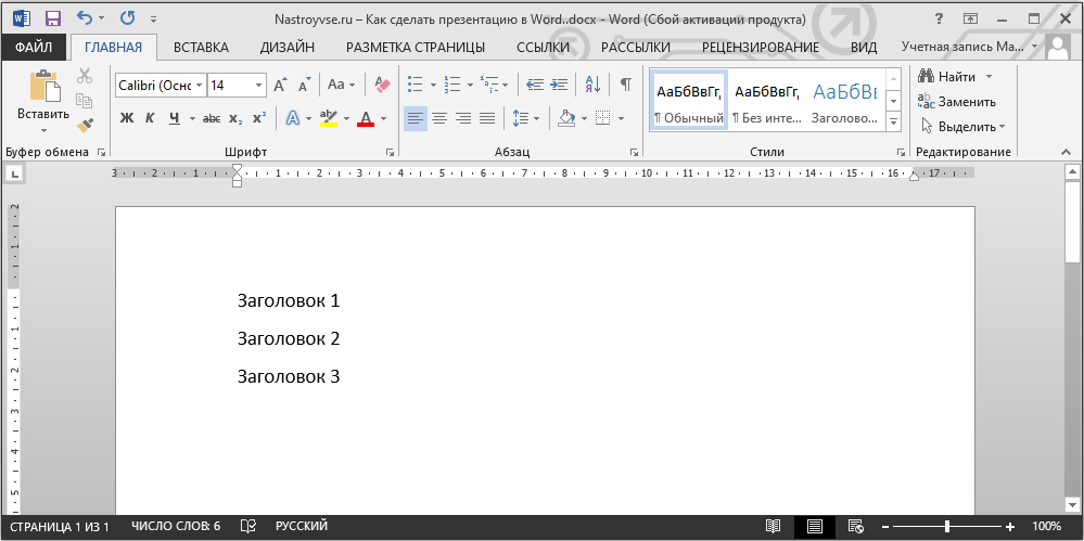
- First of all, you should write the titles of your slides in separate lines.
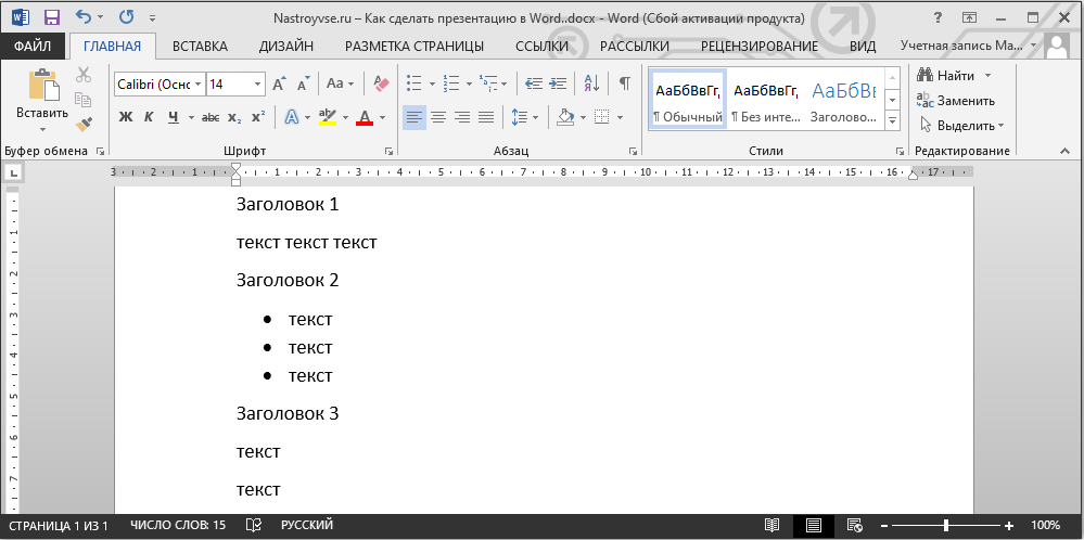
- Next, under each of them add text that will be the content of the slide. It can be in any format, multiple items, and bulleted or numbered lists.
- After that, one by one select each of the added headings and apply the Heading 1 style to them, which is located in the Home tab, on the toolbar in the Styles category.
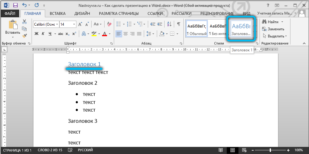
- Do the same for the rest of the text, only this time click on “Heading 2”.
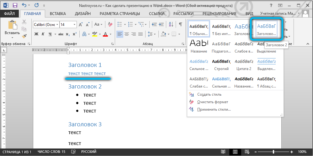
Thus, the basis for the future presentation is ready! About what information should be present in your work, read on.
Formation of information blocks
Naturally, there should be a title page at the beginning of any presentation. The “main heading” in this case should directly reflect the topic that will subsequently be revealed.
The next two slides are most often “loaded” with an introductory part. For example, the user is faced with the need to create such slides, the purpose of which will be to present the capabilities of the company, which could provide its services to another organization, in particular, for the transportation of goods. An advertising move of this kind should primarily acquaint potential customers with the slogan, achievements and capabilities of the organization. It will not be superfluous to indicate the main direction of activity.

To make such a presentation, on the first slide, it is better to put the colorful name of the company, on the second – the slogan and features, which can consist of several (3-6) smaller headings. The next couple of slides can reflect information about the company – for example, principles of work, experience gained, information about the license. In the same section, the advantages of the company over its competitors, as well as the current promotions, may be mentioned.
The last slides should reflect information that would familiarize potential consumers with the list of products and services offered. In case the list of opportunities of the organization is too huge, it will be better if the typical services are combined into groups.
The very last slide should contain only contact information. It is also permissible to use conclusions or simple generalizations here.

Editing function
Multifunctional text editor Microsoft Word will help everyone to create slides for the presentation, which can later be edited.
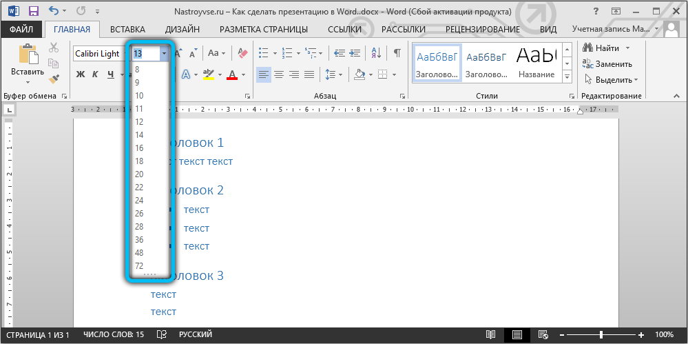
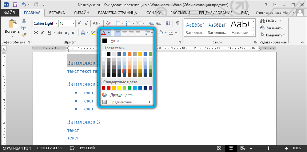
When the main presentable advertising “backbone” is created, you need to take care of editing the text. Immediately at this moment, you can start changing the general appearance, size and color of the font, as well as the entire style. You can accomplish this by highlighting the headers after the appropriate parameters are set in the command ribbon.
If you managed to create a presentation in Word that has an attractive design, do not forget about the font size. According to experts, there is a certain size of the text for a separate group of listeners. It is best to choose a size that is equal to half the age of the oldest person participating in the presentation. As practice shows, the text selected in this way turns out to be easy to read for almost everyone.
Before creating slides, do not forget about the color scheme, which will become the main background, since the color of the words you type will depend on it. The perception of the presentation directly depends on the color of the text. Therefore, it is best to choose a color scheme that will contrast with the main background. It is preferable to stop your choice on a combination of white and black or red and blue.
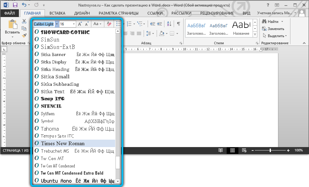
The main font should be, first of all, well readable, rather than beautiful. Before applying this or that design, you should see how it looks on the big screen. A well-chosen font helps to make your presentation in Word more attractive and modern. That is why, instead of the usual Times New Roman, it is necessary to use, for example, Lucida Console.
Beautiful design should be at the head
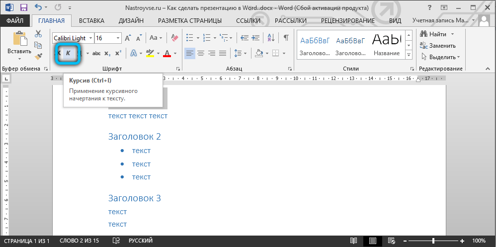
To set a specific style for headings, you need to refer to the command ribbon. The Home category contains many tools to help you edit the text in your presentation. The style should exactly repeat the nature of the presented product or service. Those who are going to present the organization of thematic children’s parties to the audience should prefer a beautiful italic design. But for those who, for example, makes a serious business proposal through a presentation, it is better to avoid it.
Importability
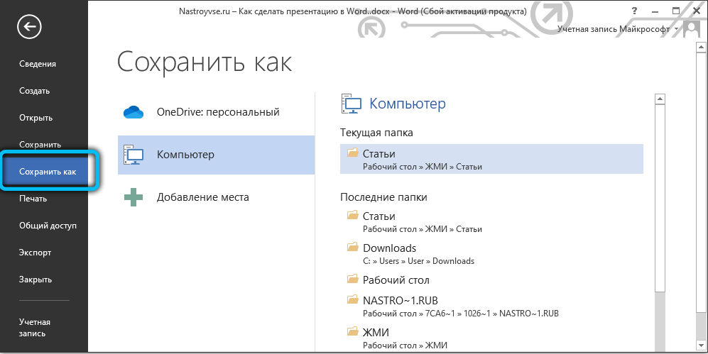
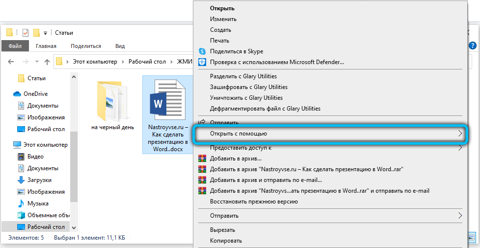
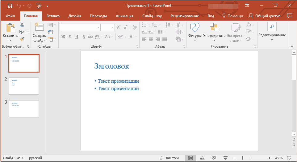
Before completing the created project, the user must take into account one small nuance, which concerns saving and closing. The fact is that after creating a presentation, the user will not be able to save this file in the usual .ppttx format. Therefore, the created document containing several headers will have to be closed first, and then, by right-clicking on the file from the drop-down context menu, select the line “Open with”. Among all other programs, you should choose Power Point.
The same procedure can be performed directly through Microsoft PowerPoint itself. To do this, run the utility and go to the “File” → “Open” section. In the window that appears, before looking for the created document, replace the line “All PowerPoint presentations” with “All structures”. Then specify the location of your work and upload it to the app.
Conclusion
Multifunctional text editor Word through specialized tools allows you to create beautiful presentations. The user needs to take into account only his wishes and the principle of the application in order to create an advertising display of his capabilities that is correct in all respects.