With the ubiquity of the Internet and social networks, the ways to deliver your service to a potential consumer or find the product or service you need have become much easier. Nevertheless, classic announcements on entrance doors, information boards and other places have not lost their relevance and effectiveness. They are still read on the way to work, to the store, or home. To issue such an ad is a seemingly simple task, but if you want your ad to be noticed, there are many nuances to consider. We will talk about them today, having considered two types of ads: classic informational, with a large text part, and tear-off, when you leave contacts for interested people to contact at the bottom of the ad in the form of tear-off coupons. Let’s consider both options in detail.
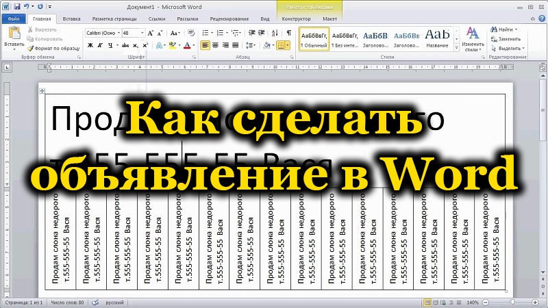
How to make a classic ad in Word
The popular text editor is definitely better than Notepad, even if you don’t need to use tear-off coupons – the possibilities for text design are much higher here, which is important if you want your information to be noticed.
Where to begin? Before you start creating your ad in Word, decide on the size of your sheet.
You can write one big ad or place two smaller ones on the page. If you want, you can place more, which will save you paper, but you should not abuse it – the smaller the font, the more likely the text will go unnoticed. The large letters are striking, and the formation of attractive headlines in print and online publications is based on this principle.
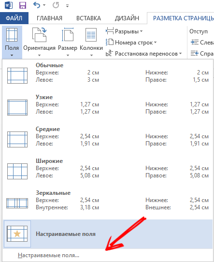
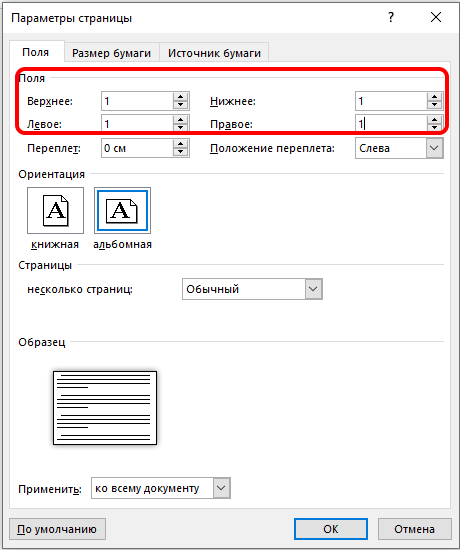
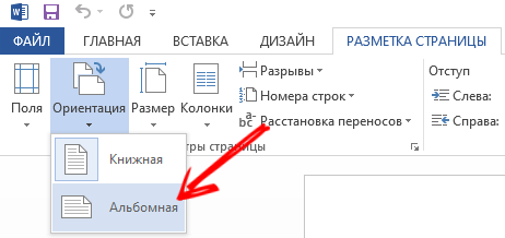
So, create a new file and go to the “Page Layout” tab. Here we are interested in the “Orientation” section, if the default is “Landscape”, nothing needs to be done, otherwise we select this particular format. Now go to the “Fields” tab and set the “Custom” mode, specifying 1 cm in the field for the numeric parameter. To make the text look even, you need to center it, which is done by pressing the center align button (the same action can be performed in the “Format” tab by clicking on the “Paragraph” button).

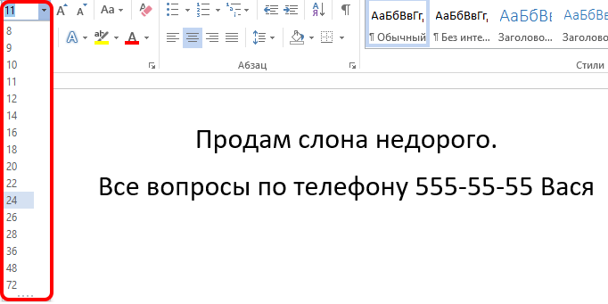
The font size depends on the amount of text and how many ads you want to place on the page. It is desirable that this parameter be as large as possible. Pick it up experimentally, you can at the final stage.
A little more about fonts. It is recommended not to use too elaborate, decorative fonts – they are difficult to read, and usually people after reading the first few phases give up this activity. Our task is for a person passing by to have the opportunity to easily grasp the entire text with a glance, running through it with his eyes and catching the essence. If he is interested in it, he will treat the text more attentively and, most likely, re-read it again, fully and concentrating.
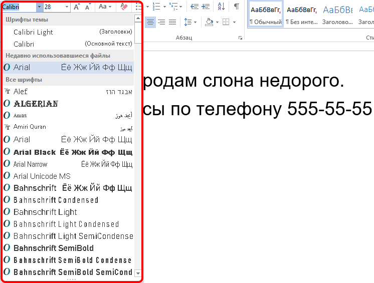
So give preference to classic fonts – Arial, Courier, Times. You should not use multiple fonts in one text either, as this will make it difficult to read. If you want variety, two will suffice. Roughly the same applies to the color scheme (if you have the ability to print the ad on a color printer, inkjet or laser). Ideally, black for body text and keywords or phrases in a different color. They can also be highlighted in a different way – in bold, for example. The use of italics, including bold, is not recommended. You should not get carried away with exclamation marks, if there are a lot of them, the reaction may be the opposite of what is expected – people do not like persistence and artificial protrusion.

Be sure to highlight your contacts, place the phone number just below the text and make the font larger than the main one.
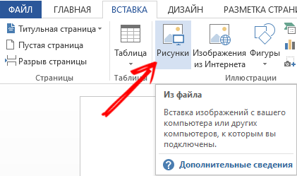
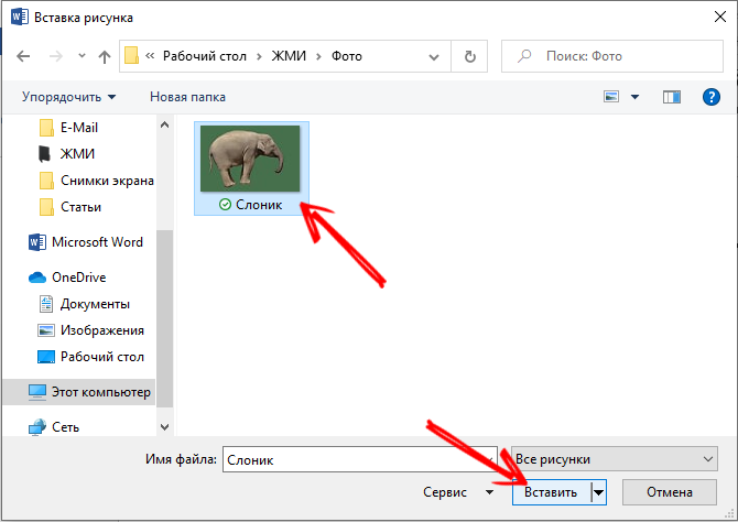
If you have a picture or photo related to the subject of your ad, it will certainly bring dry text to life, no matter how attractive it is. Often, it is the image that carries most of the information – for example, if it is a photograph of your lost pet. If your ad is advertising, it’s a good idea to showcase what you are advertising, a product or service. In any case, the image should not be too large and distract attention from the text, but it is important that the graphics are of good quality, clear and with distinguishable details. The use of a beautiful logo, if available, is encouraged – this way your ad will be better remembered and will evoke corresponding associations in the future.
We have already said that such an indicator as the fluency of reading the text (or the ability to quickly comprehend information) is very important, and it is advisable to use regular fonts here. But this law does not always work and affects people in different ways. Some of them perceive classic fonts as a sign of everyday life, not worth their attention. So sometimes fluency needs to be reduced by using rare, attention-grabbing and catchy fonts. The main condition is for them to be readable, because one thing is not a hindrance to the other.
And one more piece of advice. In all textbooks, it is recommended not to use phrases built from capital letters. This actually backfires. But it is not worth giving up the “caps” altogether: they can highlight keywords, and without fanaticism, in one, at most two places in the text.

We examined the main points of how to type / print an ad in Word, as for the posting, there is no need to come up with anything new here: these should be crowded places. If the ad is designed for a certain category of citizens, then it is advisable to post them in the place of the greatest concentration of the target audience.
How to type a tear-off ad in Word
If you look at the city notice boards, you will notice that the prevailing type will be leaflets with vouchers. If this is a private ad, then in this way you will provide an opportunity to remember your contact phone number (website address, e-mail address) without looking for paper and pen, which is very difficult in field conditions.
The problem is that in order for the maximum number of such contacts to fit on the sheet, they must be placed in a vertical orientation. Next, we’ll take a look at how to flip pieces of text in Word.
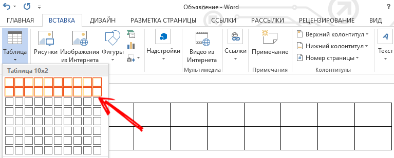
The easiest way to do this is provided by a table. You most likely know how to create them. If not, recall: go to the “Insert” menu and select the “Tables” item (there are other ways, and they may differ from version to version). We decide on the number of rows and columns, there can be two or one rows, columns – according to the number of tear-off coupons. Columns in which case it will be possible to add or, conversely, delete.
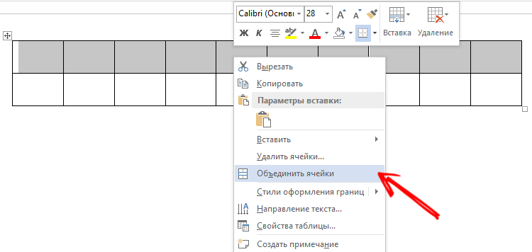
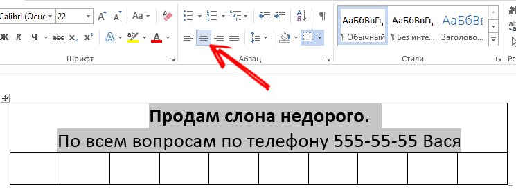
If we chose the option with two lines, the top one can be used to write a short explanatory text. To do this, select all the cells of the first row, right-click on this area and select the “Merge Cells” option (if it is present in the toolbar, just click the corresponding button). It is not necessary to increase the line size, if you type the text in a large font, the cell height will be increased automatically. After the text is typed, you need to center it by clicking the corresponding button in the toolbar. If you think that the top and bottom borders of the cell are too close to the text, just drag the bottom border down, widening this gap. Usually this line contains a simple text like “Call by phone:”, but you can also add a time interval,during which you can answer calls without any problems.
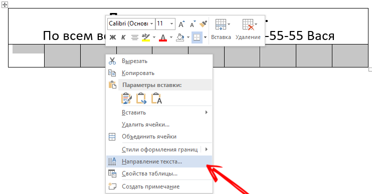
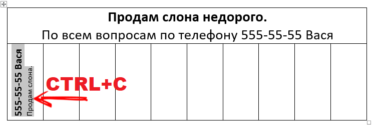
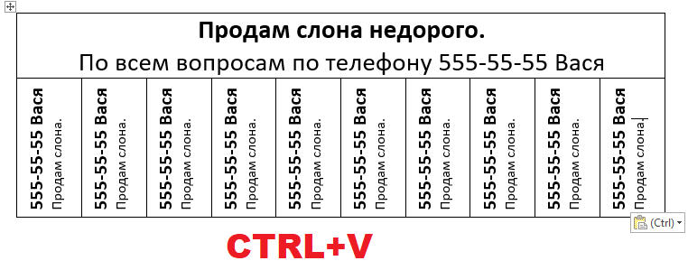
In the second line we will place the contact phone number. We will not worry about sizes for now, our main task is to write repeating information so that the text is oriented vertically. To do this, select all the cells in the bottom row, right-click, select the “Orientation” item in the context menu that appears and select the desired option. Now we enter the phone number (or other contact information) in the first cell and see how readable it is and how much space it takes. In order not to retype this data, we take the first cell as a sample, copy its contents and paste it into all the others by selecting them and pressing Ctrl + V. Now we look, some cells did not get out of the sheet. If yes, then you can proceed as follows: delete columns one by one until they fit on the sheet, or reduce the font,by selecting all the cells and changing the font size in sizes. At the same time, there is no need to pay special attention to how readable the phone is: even if the font turns out to be small, it will certainly be read if they are interested in the announcement and tear off a piece of paper with the phone.
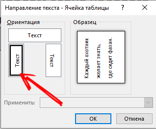
If you want to align the table to the width of the text, you can do this in the “Layout” tab by changing the width of the columns.
So, we looked at the recommendations on how to write an ad in Word correctly. Did you succeed? You can share your experience in creating ads in the comments, readers will be interested.