Contents
The update to Android 9 Pie for the Galaxy S9 and S9 + is expected before the end of the year. But before that happens, you can take a look at the changes. And they are diverse.
- Android P beta shows: Galaxy S10 comes in four versions
- Samsung Galaxy S9 + in the test: more than just a stretched S9
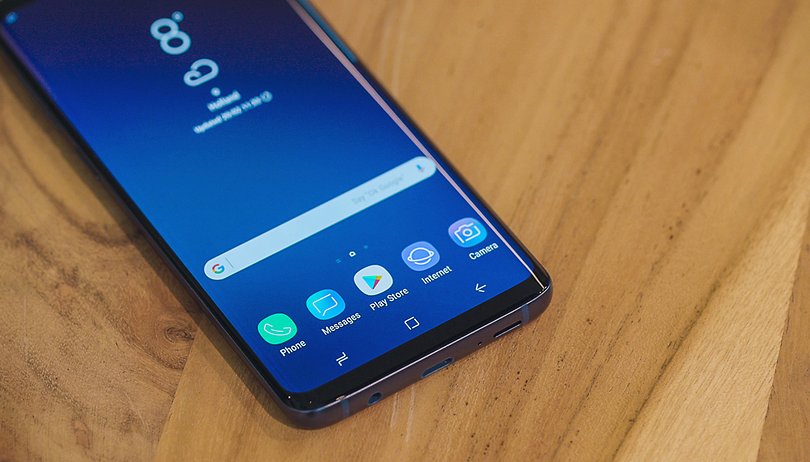
Samsung is currently working hard on Android 9 Pie for the Galaxy S9 and S9 +. An early version of the next firmware could already get its hands on Firmware.Sience. In turn, Rydah grabbed it from the SamCentral Discord and installed it on his Plus model. The still very unstable build shows which big changes Samsung is making with its Samsung Experience 10 interface.
Samsung Experience 10: Painted Black
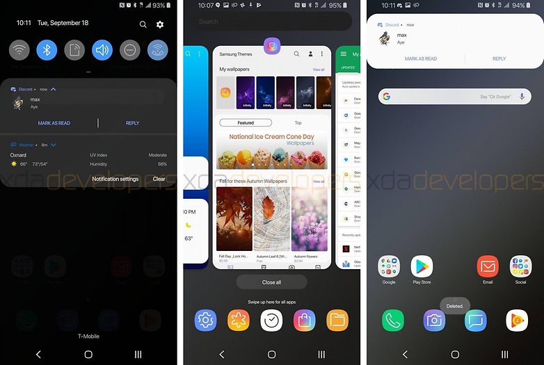
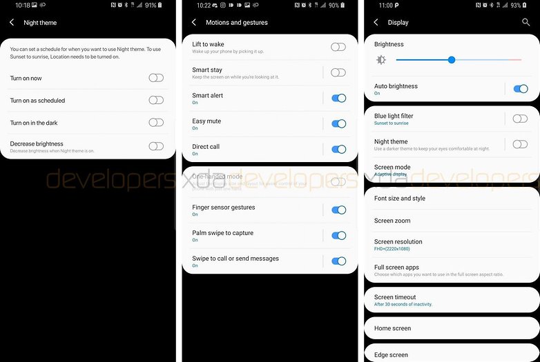
Brand new is the black surface, which should improve the battery life in connection with the OLED display. The buttons in the quick settings are now round and no longer allow you to change the WLAN directly or to connect the smartphone to another Bluetooth device. If the notification line is pulled down again from the quick settings, it now fills the entire screen.
Samsung has also taken over the overview of the open apps from Google. The apps are now arranged horizontally and five apps are suggested below. The notification windows are now also significantly more rounded than before.

Samsung Experience 10: Samsung-style gesture control
In the system settings, a gesture menu has been added to clearly show the various options for interacting with the smartphone. It also includes waking up when lifting the device or wiping the fingerprint sensor.

However , Samsung has changed the gesture control of Android 9 Pie . The three navigation buttons are simply hidden here and displayed as narrow lines at the bottom of the screen. By swiping upwards, actions such as back , back to the start screen and the display of the open apps are carried out.
Samsung Experience 10: New design for the Samsung apps
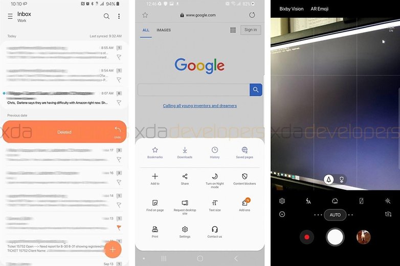
Samsung also screwed on its own system apps. Among other things, Samsung Mail, the gallery and the camera app were tackled here. Everywhere you can see rounded corners and the adjustment for the optional dark system surface. The camera got a completely new UI. The various settings for the flash, timer or picture format have moved down to the shutter release and are therefore easier to reach with one hand.

Samsung has also made some changes to the lock screen, Bixby and the messaging app. You can view all changes in detail at the XDA developers . There is also a guide to install the early build on your own smartphone. But the version is still very unstable, peppered with bugs and the rollback to the stable version is difficult.
- Guide: Try Samsung Experience 10 yourself
Last year, Samsung only completed the first build of Android 8 Oreo for the Galaxy S8 in November . It is now mid-September and you can already get an insight into the new version. This gives hope that Project Treble will at least have some effect and that owners of a Galaxy smartphone will be able to enjoy the latest version of Android faster this year.
What do you think of all the changes? Is Samsung going in the right direction? Do you want completely different changes to the current surface? Let us know in the comments!
