If you have an Android mobile, an essential element in it is undoubtedly the application store. Although there are secondary stores and websites where you can download APKs, the reality is that the Google store is undoubtedly the most recommended and the most used to buy new apps. And if you’ve downloaded any recently, you’ve probably come across the new Google Play Store design for 2022 .
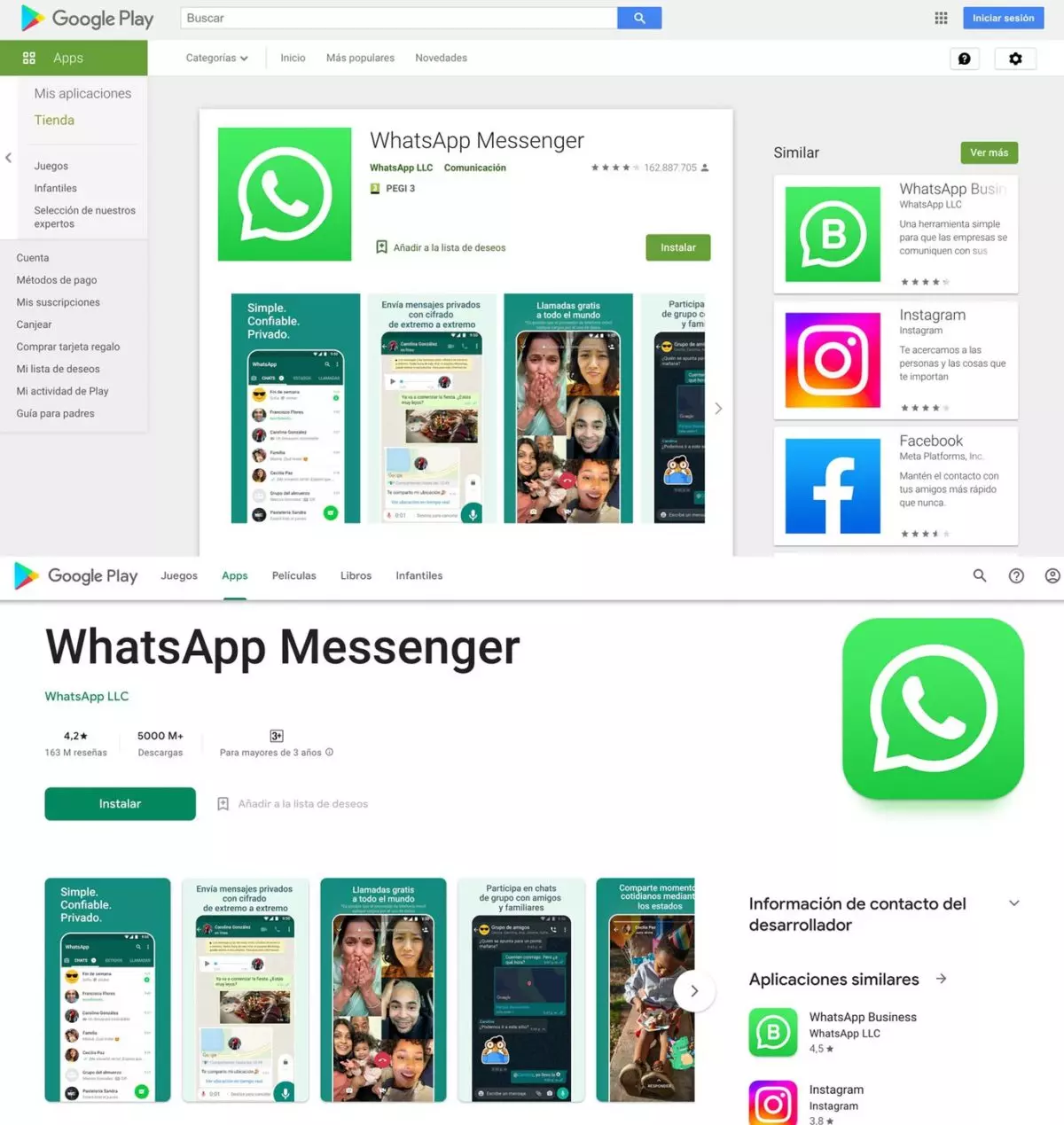
The substantial change in the design has taken place in its web version . In fact, what Google has done is to bring the web version closer to the design of its mobile app , so that everything is more consistent. As it was for a while until the app was updated and the browser version stayed the same. This new design began to be implemented a few months ago in mainly Asian countries, but it was not until a few days ago that we began to be able to use it in Spain when we access it from a browser.
The first thing that strikes us is that it is a more minimalist design , in which white predominates and the boxes and margins are reduced.

With fewer margins, there is more space for information about the application . The images also have a larger space, and both the features of the app and the first comments about it can be better appreciated at a first glance.
Something that is particularly striking is the disappearance of the menu that appeared on the left side of the store in the browser. Now, to access it we have to click on our Google profile picture, which appears in the upper right corner of the store. In this way, the Google Play Store leaves more space for what really interests us, which is the app, and leaves the small details and menus that we may need in occasional moments a little more hidden. The Install button has also been given more prominence, so that it is not only simpler but also easier to use for newbies.
The recommendations for new apps are still where they were, although they are now shown in a slightly clearer way and without as much graphical distraction.

WHAT HAS CHANGED IN THE GOOGLE PLAY STORE IN 2022
If you are wondering what has changed in the Google Play Store in 2022 , you will be pleased to know that the only changes are those related to the design that we have discussed and that you can see in the images at the top of this post. There has been no substantial change to how the app store works, so you can continue to use it exactly the same way you did before.
Thus, you will be able to navigate without major complications through all the applications that we find in this store, read all the information about it and the comments of other users. And you can also download them, even remotely. In other words, if you log in to your PC with your Google account, you can install apps on your smartphone or tablet directly from your computer, without having to have the device in your hand.
Therefore, apart from being a little unsettled by the design change, you will not need to learn anything new about the use of this tool.
In the event that you enter the Play Store and continue to find yourself with the old model, we recommend that you try to delete cookies, browse in incognito mode or even try another browser. But in general we would tell you to just have a little patience since the new design is progressively reaching users and it may not have reached you yet.